2. How Effective Is The Combination Of Your Main Product and Ancillary Texts?
We knew straight away when hearing “Piledriver Waltz” that we wanted to use it as our chosen song. The messages of the song seemed to stare out at us and therefore we felt it necessary to include them in our video. Another reason we decided to use this song was because there was no official music video created for it already, therefore we had no influences behind our choice of setting and action.
The lyrics of the song mention, misery, heartbreak, losing someone and unhappy endings, however we didn’t want the video itself to appear to be too miserable as we assumed it would distract from the genre of the song, maybe straying to a more emo side. That is when we came up with the idea of playing the video in reverse, although in the storyline she ends up jumping into the river, when watching it, the video ends with her getting back with the one she loves.
We decided to use nature as a key element in our video, after watching many music videos of this genre including, Slow Moving Mile, Coldplay, The Script and many more, we realized that trees and greenery are included a lot in their videos. Also, practically, our school is located adjacent to the river thames and is surrounded by trees and woods. When we did most of our filming (which was during our Media Studies lessons) we were able to use these facilities to our advantage as opposed to traveling outside of school to take our footage.
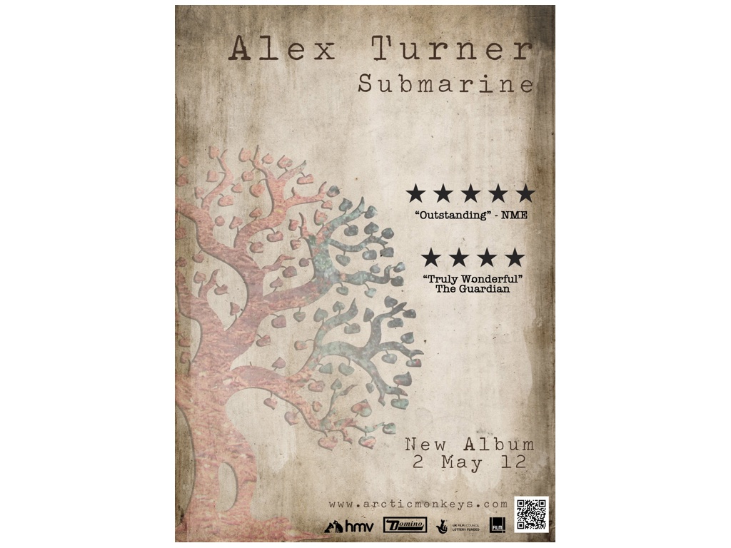
As nature was so important in our video, we decided to use Trees as our underlying theme. That is where the idea of our digipack came along from. The image behind the outline of the tree was taken from one of our location shoots of some leaves on the ground, however we thought the colours added an interesting aspect to the colours of a tree. The font we used, we downloaded online. It seemed to be a clear and legible font yet it also appeared to be quite aged. This appealed to us as the background of our digipack looks like old and torn paper and we believed that the font effectively matched it. We wanted to keep the digipack simple and flowing and therefore we kept the same image for the back cover, only moved it to the right hand side and changed the opacity so the text would stand out more so than the image. Our chosen song is from the soundtrack from the film “Submarine” and we included information about the film in the written text about the album. The other two images used in our digi pack we took on our location shoots. The image of the building was used in our music video and therefore there is a clear link between the ancillary tasks and the main product.
The poster we created was very similar to the front cover of our cd digi-pack as we wished to create an obvious link between the two. For an audience point of view, to see the poster in a magazine they can immediately recognize the album from the imagery used on the poster. We wanted to include the ratings on the right hand size for several reasons. One as an artistic reason, without them, the side of the page would have looked empty and the image of the tree would have looked a bit lost. Another reasons we included the ratings was to convey to the audience the value of the album.